Archive
Plotting postcode density heatmaps in R
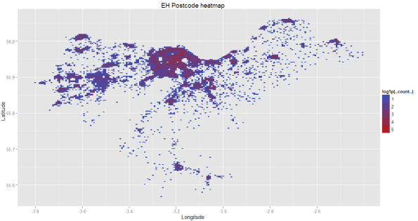
Here in the UK, postcode geodata was recently released as part of the OS Opendata initiative. Although not the full postcode address file (PAF), it’s enough to be useful for visualisation purposes!
I thought it’d be interesting to plot the density of postcodes in a heatmap, as a way of getting a visualisation of population density.
I downloaded a copy from MySociety. The raw data uses the Ordnance Survey coordinate systems (Eastings and Northings), but MySociety also provide a version with coordinates converted to the WGS84 datum (latitude and longitude). It gets better; one file per outcode (so all the EH postcodes go in one file, for example).
So how to plot this?
I’ve been using R with the ggplot2 library for visualisations; it’s an amazing toolset, and you’d be surprised how few lines of code it takes to get results.
First of all, download the data.
Now, extract the data for the EH postcode area.
The first step is to load the extracted CSV file into a data frame. There are no column headers (header=F) and the file is comma separated (sep=”,”)
inp <- read.table("c:\\infoviz\\ehpostcode.csv",header=F, sep=",")
Next, a quick hack to remove certain postcodes which seem way out of the region of Edinburgh. I’ve yet to work out what these stray postcodes are.
inp <- subset(inp,inp$V10 != "")
Now we bring in the ggplot2 library..
library(ggplot2)
Now the plot itself.
m <- qplot(xlab="Longitude",ylab="Latitude",main="EH Postcode heatmap",geom="blank",x=inp$V3,y=inp$V4,data=inp) + stat_bin2d(bins =200,aes(fill = log1p(..count..)))
The stat_bin2d does the binned heatmap plot. It splits the area into a grid of 200×200 (‘bins’) and counts the number of postcodes in each grid square. These counts are then scaled logarithmically (fill = log1p(..count..)).
Finally, we plot this puppy.
m
That’s it! Five lines of code.
Here’s the whole chunk..
inp <- read.table("c:\\infoviz\\ehpostcode.csv",header=F, sep=",")
inp <- subset(inp,inp$V10 != "")
library(ggplot2)
m <- qplot(xlab="Longitude",ylab="Latitude",main="EH Postcode heatmap",geom="blank",x=inp$V3,y=inp$V4,data=inp)  + stat_bin2d(bins =200,aes(fill = log1p(..count..)))
m
If you set the boundaries of the x and y axes, you can then use the resulting image as an overlay in Google Earth.
I found that the heatmap is a reasonably good proxy for population density – but with exceptions. There are hotspots that turn out to be postal sorting offices – PO boxes and post restante.
unemployment statistics in the UK
Visualizing recent trends in benefit claimant counts in the UK.
Unemployment data from the Guardian Data Blog.
Constituency coordinates courtesy of the TheyWorkForYou API.
The three heatmaps show, respectively, from left to right:-
(1) the %age change in those claiming benefits (hotspot in the Thames Valley)
(2) the %age of the workforce out of work and claiming benefits (hotspots in the Midlands, Hull, London, Liverpool, Glasgow)
(3) the gender ratio of claimant percentages. Red=higher ratio of male to female claimants, blue=lower ratio of male to female claimants
map of the flags of the world
A map of the flags of the world.
mapping flickr group activity

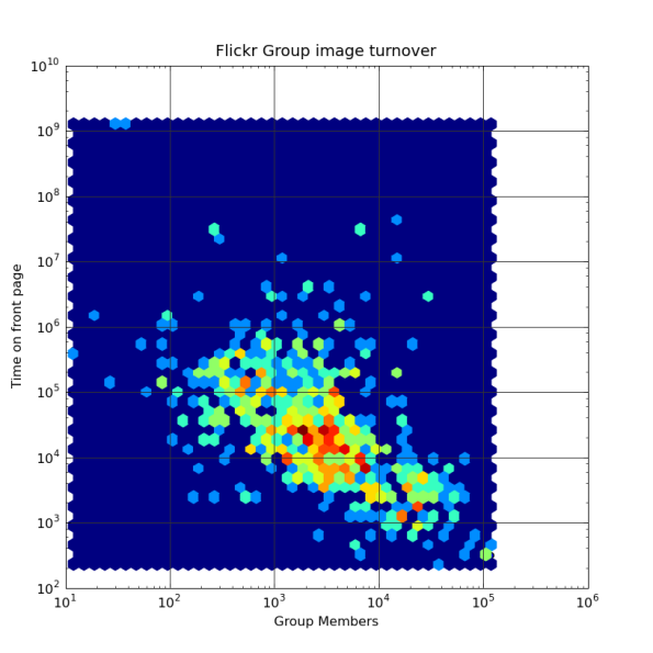
Mapping the activity levels of approx 1,500 Flickr groups against the number of members of each group, using the Flickr API.
The x axis is the group size, the y axis is the number of seconds an image can expect to stay on the ‘front page’. This was measured as the timestamp difference between the 1st and 13th images in the pool (the landing page for a group shows 12 images; the user has to follow a link to show more).
Note that the image is a log-log plot, as the groups follow a power-law distribution.
Groups in the bottom right are the busiest – this includes the B&W and FlickrCentral groups. Groups in the top right have lots of members but are more vigorously moderated, so images are added to the pool more slowly (or new submissions are deleted). The group touching the bottom of the graph is the “10 million images” group, where users are encouraged to “dump and run”.
This is a hexbin plot – the colour represents the number of groups falling within a certain range of values. Red=Lots, Green=Fewer, Blue=Few.
As you’d expect, larger groups tend to have a higher turnaround of images, but there’s a lot of variation.
The most common group size seems to be around 2000-3000 members; a group this size, you can expect an image to stay on the front page for around 2-3 hours. With the largest groups, this drops to around 5 minutes.
Mapping 24 hours of Flickr geotagging in Python
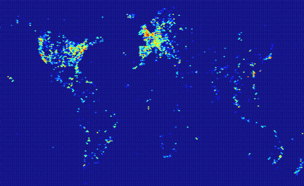
The aim of this project was to find out where in the world people were geotagging their photos on flickR, using the flickR API.

The approach taken was to poll one of the flickR ‘pandas’, ‘Wang Wang’. This is a service which keeps track of geotagged photos as they come in.
The following Python script runs in the background, polls the service once a minute, and appends the location of newly tagged photos to a CSV file. It only asks for up to 100 photos in the previous minute; in reality, up to 120 are returned in any one minute! The average was around 80/minute when I last ran this.
The flickr API is being accessed using beej’s flickr api.
# -*- coding: UTF8 -*-
'''
Created on 28 Apr 2009
Ask WangWang for recently geotagged photos
@author: Steven
'''

import flickrapi
import datetime
import string
from time import time as t
import time

api_key = 'YOUR_API_KEY_HERE'
flickr = flickrapi.FlickrAPI(api_key)
if __name__ == '__main__':
    ct=0
    lastct=0
    print "Timestamp  Total   This"
    while True:
        tstamp=int(t())-60
        wangwang = flickr.panda_getPhotos(panda_name='wang wang', interval=60000, per_page=100, last_update=tstamp, extras='geo')
        fo=open("c:\\wangwang24hours.csv","a")
        for x in wangwang.find('photos'):
            s= "%d,%s,%s,%s\n" % (tstamp, x.get('longitude'),x.get('latitude'),x.get('id'))
            ct=ct+1
            fo.write(s)
        time.sleep(60)
        fo.close()
        print "%10s %07d %04d" %(tstamp,ct,ct-lastct)
        lastct=ct
    print 'done'
Once we have the data, it’s time to visualise it. A heatmap seemed a good choice; the chart uses the Matplotlib ‘hexbin’ style. This takes two arrays of the same size (here, the longitudes are in X and the latitudes in Y) and maps the values onto a hexagonal grid (here, of size 180×180), counting the number of photos which fall into each hexagonal bin.
Each bin is coloured according to the number of points that fall into it; red have most, green have less, blue have the least.
The following script takes the output from the previous script, and plots it.
import numpy as np
import matplotlib.cm as cm
import matplotlib.pyplot as plt
import string

X=[]
Y=[]
fi=open(r"c:\wangwang24hours.csv")
for line in fi:
    ignore,x,y,ignore2=string.split(line, ",")
    if x!='None' and y!='None':
        X.append(float(x))
        Y.append(float(y))
fi.close()
hexbin(X,Y,gridsize=180,bins='log',cmap=cm.jet,linewidths=0,edgecolors=None)
show()


